Share
You might have noticed that last quarter we did a lot of work to help your team get useful insights from Memfault as efficiently as possible. Some highlights:
- More customizable dashboards
- New charts for better data visualization
- Metric data available in charts in “real time” (as soon as it’s received by Memfault)
These new features empower you to collect the data you need, easily visualize it, and arrange it in a way that makes sense for you. And we want you to be able to do all of this without requiring a data team, a mobile team, or a back-end team.
This quarter, we’re thrilled to announce our biggest product update yet.
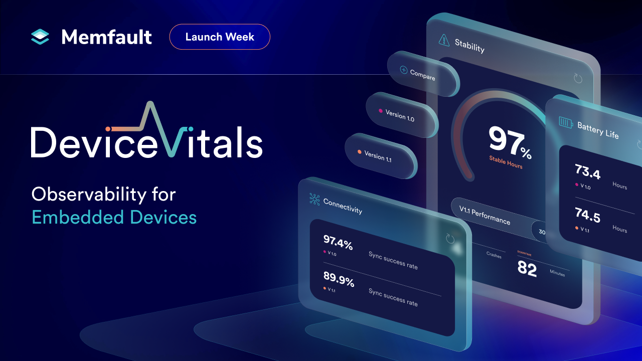
Introducing Device Vitals
What Are Device Vitals?
Device Vitals are a standardized set of data points we believe everyone should monitor, in some combination, on their embedded devices. As soon as you log into Memfault, you’ll have a view of three vital signs for your devices in the field:
- Stability
- Connectivity
- Battery
You can collect meaningful data and get insights against these important performance and quality measures right away. And if you’re new to Memfault, they will make it much easier to get up and running.
Device Vitals give you a great baseline to build from. Even if these are the only metrics you collect, you are still going to get valuable insights. Combine that with the crash data collection Memfault provides and you have the tools you need to proactively identify and fix problems, quickly and efficiently.
If you have other critical metrics you already know you want to monitor, great! Add those in. And if not, you will still get value right away.
Improved Ease of Use
This quarter, we’ve also made improvements to the way you interact with data in Memfault by consolidating dashboarding into one consistent experience.
Memfault collects data from a lot of different sources. It’s not just metric data, but also coredumps, logs, attributes, reboots reasons and more.
Historically, these different data points could be visualized and analyzed in different ways across the product. We had a series of legacy dashboards, including Overview, Metrics (which we made customizable in our previous release), and Device Sets. These dashboards all reported different data in slightly different ways. The challenge was, this often forced users to jump between multiple dashboards to get the insights they needed. The other limitation was that each dashboard had a slightly different set of capabilities around filtering of the data.
Not anymore.
All Data Sources—Any Dashboard
With this release, we are continuing to consolidate the dashboarding experience across Memfault. Users can now add any chart type or card, from any of the previous dashboards into any dashboard. You can create custom dashboards, edit existing dashboards, and combine data from all different sources in one place.
Charts and cards that used to be exclusive to either the Overview or Device Sets dashboards are now available to add into any dashboard. And don’t forget, we also recently released layout mode for dashboards, letting you drag, drop, and resize everything on your dashboard.
See How It Works
Watch the video below to see an overview of these improvements, plus a number of other new features. Or, keep reading to find out more.
New Features
Save Dashboard Filters
Users can now save dashboard wide live filters so that every time you or another user on your project loads that dashboard, they will see the same pre-filtered sample of data.
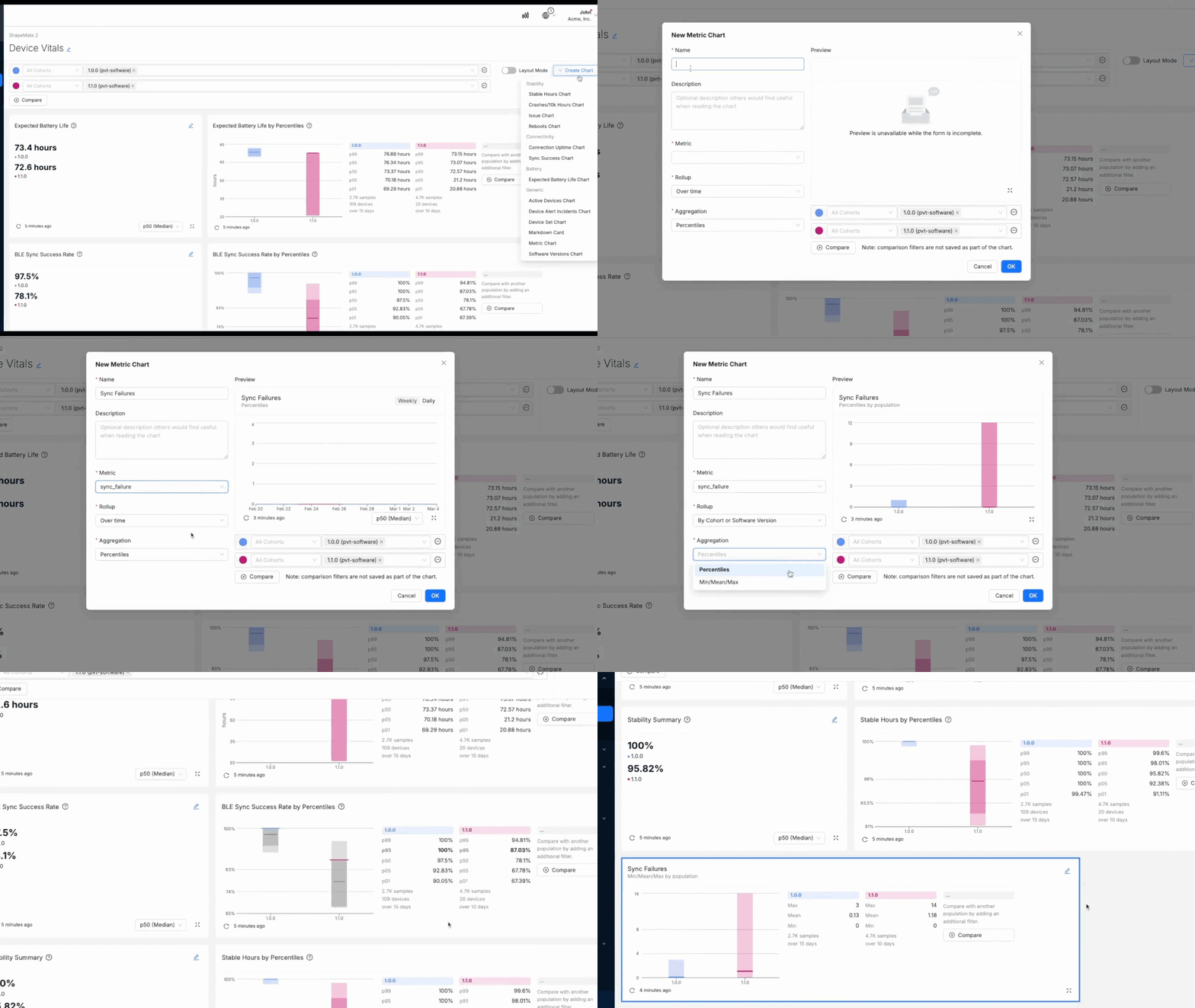
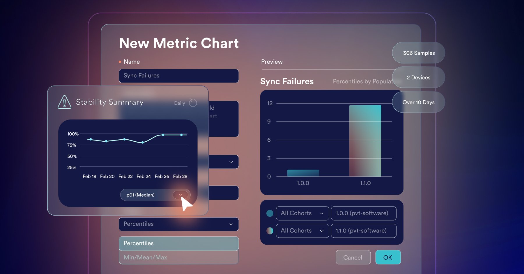
New Chart Preview Modal
Now it’s easy to build the right chart, the first time. Preview the impact of different rollups, aggregations, and filters on your data before adding the chart to your dashboard.
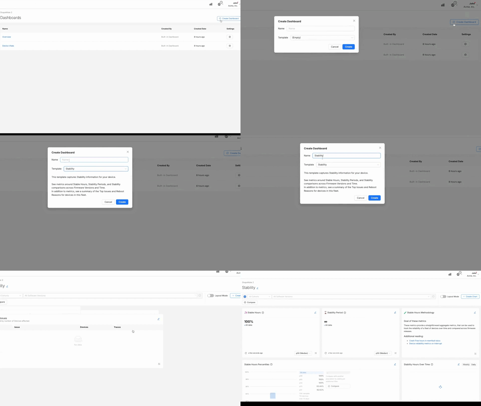
Pre-built Device Vitals Dashboards
We have added a set of template dashboards to make it easy to get started with the different Device Vitals. These template dashboards contain a number of different charts and cards we believe are most relevant for each Device Vital, but if you think we are missing something, you can customize these dashboards just like any other.
Device Vitals Chart Drilldowns
It’s one thing to be able to see the top-level data and take insights from the population-wide data presented in charts; it’s another thing to investigate issues when they arise in this data.
Previously, if you spotted something off in your charts, getting to the actual devices that were skewing your data was difficult. This was a painful problem and reduced the overall usefulness of the insights and early warning our charts could provide.
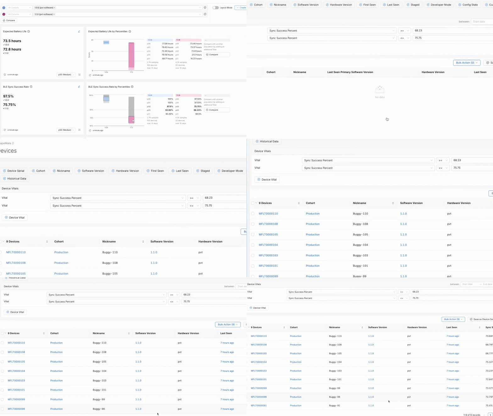
That’s why we are excited to have released our new drilldown functionality for Device Vitals charts (and hopefully in the future, more chart types).
Put simply, it allows you to drill down to see the actual devices within a percentile of your population by simply clicking on the percentile within the chart on your dashboard.
You are then presented with a pre-filtered list of devices that have reported Device Vitals within the margins for that percentile. All you need to do next is pick a device and dive in. This should take you from fault found to problem solved, at least a little bit faster.
Device Timeline Pan and Zoom Improvements
Ok, this might seem like a small one, but digging into the data on the device timeline needs to be as easy and intuitive as possible. It’s a key view for our users and being able to align crashes with metric conditions is a critical part of the debugging process.
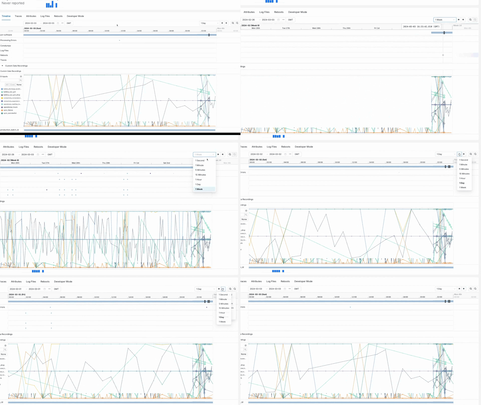
So we made some small but significant improvements to help users navigate through the timeline more easily.
Users can now use the dropdown to select the time window they would like to view (e.g. 1 day) and then step back and forward by the defined time window (e.g. 1 day per step) with a click. Track down the detail you are looking for on the timeline faster and more efficiently.
Issue to Device Attribute Correlations
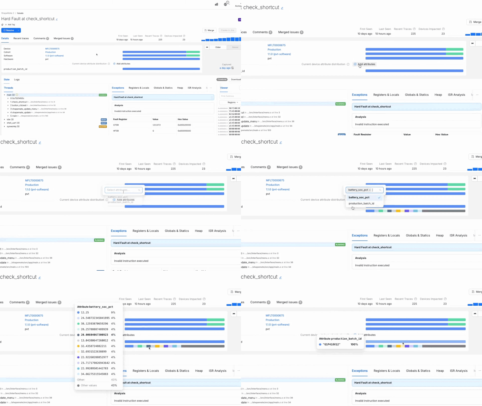
And last but definitely not least, we have added the ability to include Device Attributes on the issue view so that you can see if there are any correlations. This is super powerful. You can correlate issues with things like a specific production batch, a specific location, or similar.
In the example in the demo below, we notice that our battery issue is actually correlated with a specific production batch and likely not to be related to something we have done with our latest release.
Currently, the correlation is best used on attributes that don’t change because it only reflects the current distribution of that specific attribute. In the future, we would like to make it possible to reflect the distribution of the attribute present at the time of the trace.
That’s a Wrap!
We are really excited about how Device Vitals, dashboarding improvements, and other new features and enhancements will improve the core experience for users of our product. It’s now easier to:
- Collect the right data with Device Vitals
- Analyze that data and get valuable insights
- Drill down to investigate problems
And the cherry on top is issue-attribute correlation, which adds another powerful tool for fault investigations.
We think these changes will help new customers get value from Memfault much faster and help our existing customers get crucial insights more easily and efficiently.
What Do You Think?
As always, if you have questions about any of the features included in this release, or anything else Memfault-related, we’d love to hear from you. If you are already a Memfault customer and want to find out more please contact your account manager. If you are not a Memfault customer – book a demo with our team or take a look at our technical documentation.
If you haven’t already seen it, be sure to check out our CEO, François Baldassari, introducing our new Device Vitals feature. You can also find a link to his keynote and other helpful resources on our Device Vitals Launch Week page.
Enjoy!

.gif)
