Skip to the content
Share
An IoT monitoring dashboard is a great way to track and understand IoT device performance. Follow these expert tips and real-world examples to create an effective dashboard for a variety of stakeholders.
So: you’re an embedded developer, and you’ve released a bunch of new “smart” devices into the wild. You’ve added your very own “things” to the Internet of Things, and now you want to know: are they doing what they’re supposed to be doing? Performing how you want them to perform? Let’s assume you have an IoT device monitoring solution (like Memfault) for gathering robust metric and crash data from your fleet. Now you need something to display this data—not just for yourself, but for the other people on your team responsible for making your IoT device successful.
What you need is (you guessed it!) an IoT monitoring dashboard.
But before we get into the nitty-gritty of how to develop dashboards so you can track and share the most important metrics for your IoT projects, we have to talk about something much more complicated: Humans.
The Golden Rule: Know Your Audience
Identifying the intended audience of your IoT monitoring dashboard is the first step toward making it effective and useful. Start with a clear understanding of who your dashboard’s primary users are.
Below are several specific roles and their needs in device monitoring.
Engineers and Technical Teams
As the people responsible for developing and maintaining the software and firmware of your embedded devices, these users need detailed, technical insights to troubleshoot and optimize device performance.
They’ll want information that helps them debug devices in real-time, like detailed metrics, crash reports, performance analytics, and domain-specific data so they can focus on improving specific, essential functions of their devices.
Release Managers (RMs)
While RMs may have specific metrics they want to monitor—areas where their team is responsible for making improvements—they may be even more interested in monitoring for regressions in unexpected domains.
Slicing data by software versions and cohorts (like a “beta” vs. a “production” device cohort) allows these users to isolate just the devices in a beta-release population from the general population, and helps them make important “go/no-go” decisions.
Product Managers (PMs)
PMs are interested in the overall health and performance trends of devices. Summaries and percentile visualizations can provide them with the necessary insights to make informed product decisions.
Customer Support Teams
Support personnel benefit from dashboards that highlight common issues or trends in device performance. This information helps them address customer concerns more effectively, identify areas for improvement, and escalate issues appropriately.
Executives
High-level dashboards that summarize device fleet health, usage patterns, and key performance indicators (KPIs) are valuable for executive teams. These dashboards should provide a quick snapshot of the business impact of device performance.
Know Your Audience’s Likely Questions
Once you’ve identified the primary users of your IoT monitoring dashboard, come up with questions that these users will want answers to when visiting your dashboard. Strive to include only metrics and data points that can directly help them answer those questions, and avoid cluttering the dashboard with unnecessary information that could distract or confuse your audience.
Adjust the level of detail and complexity based on the user’s presumed technical background and information needs. For instance, technical teams may appreciate deeper insights, while executives might prefer simplified, high-level overviews.
It is possible to create dashboards that satisfy the needs of multiple different personas all at the same time—especially if you identify that these different personas will want answers to the same questions. However, doing so runs the risk of reducing the “signal to noise” ratio of your dashboards. Any piece of information on a dashboard that a given user finds useless costs them time that they won’t consider well-spent.
And if your dashboards are too “noisy,” your audience may not want to use them at all.
6 Tips for Composing an Effective IoT Monitoring Dashboard
A well-composed IoT monitoring dashboard not only presents data clearly, but also guides the user through a logical narrative, helping them understand the most important information first and providing more detailed data as needed. Consider the following tips when organizing dashboard elements for optimal user experience.
1: Keep Key Metrics at the Top
Based on your understanding of your audience and their likely questions, identify the most critical metrics or data points your audience needs to see. These should be placed prominently on the dashboard (often at the top) to catch the user’s attention first. Less scrolling means time saved for your users every time they visit the page.
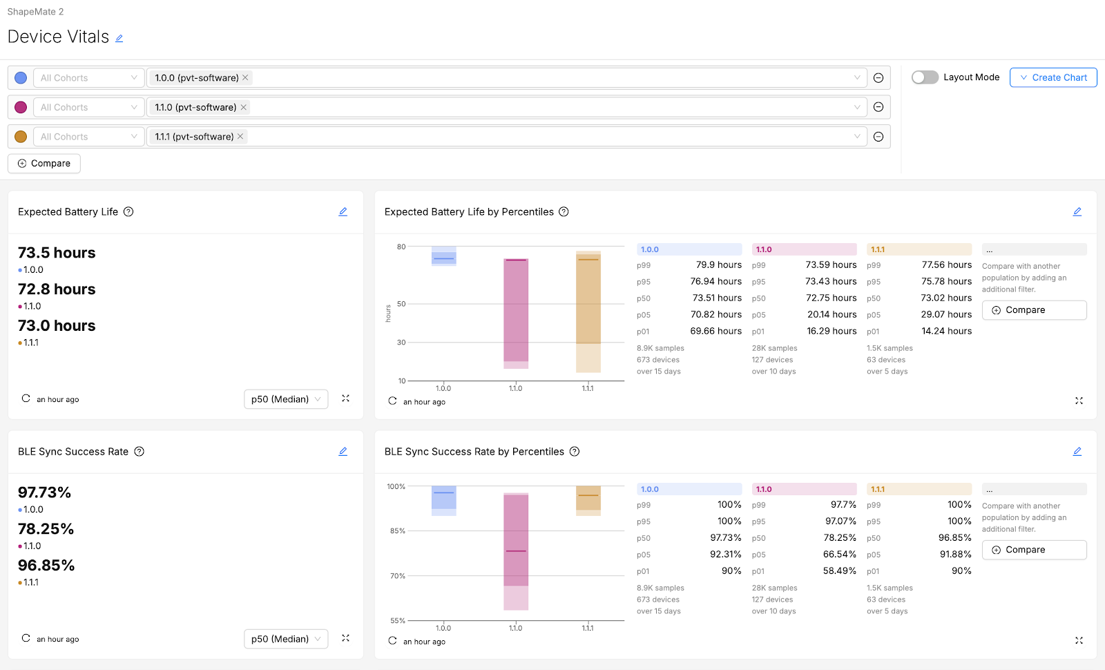
For example, in the above screenshot, if “Expected Battery Life” is likely to be of greater concern or importance than “Sync Success Rate” to the intended audience, then its placement at the top of the dashboard is optimal.
Related: Understanding Battery Performance of IoT Devices
2: Group Things Logically
Group related metrics and visualizations together. For example, if you have a number of visualizations related to device stability, group these in one section, while using another section (or even another dashboard) to focus on connectivity monitoring. If users have to scroll up or down to try to find and compare two different visualizations that they wish were side-by-side, they may quickly become frustrated.
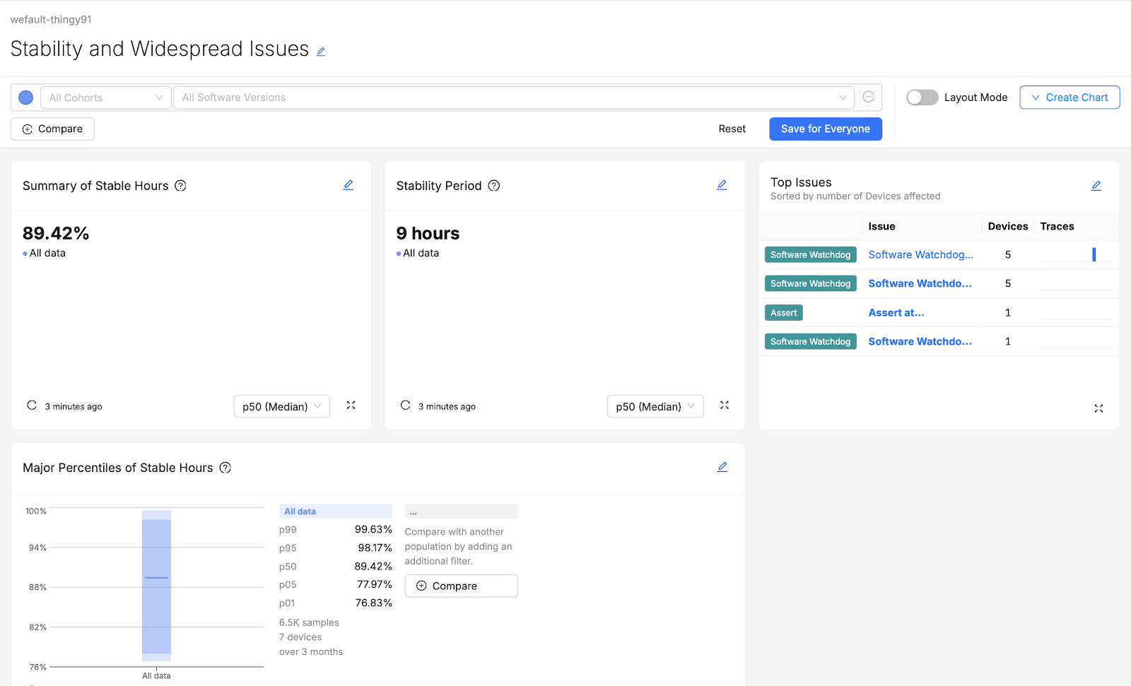
The above screenshot shows a dashboard for users who are not only monitoring stable hours, but also triaging the spread of certain software watchdog issues. Grouping the “Stable Hours” summaries and “Top Issues” charts together saves these users time.
3: Find Your Flow (of Information)
Arrange dashboard elements in a logical order that matches how your audience will use them. For technical dashboards, you might start with high-level overviews and move towards more detailed diagnostics. On the other hand, for executive dashboards, try a top-down approach that starts with summaries of key performance indicators before moving towards supporting data that provides additional context (like trends, general causes, and plain-language explanations).

For example, the above screenshot of a dashboard is designed for consumption by an executive, like a Director of Firmware Engineering. While there may be important context behind these top-line figures, a busy executive may not want to be confronted with that right away.
Including additional “Major Percentiles” charts or “Over Time” charts below the fold of the page allows them to keep digging for further information and context if they want it. But if the top-line numbers look good, they may not feel the need.
4: Consistency Counts
Use a consistent layout and design scheme throughout individual dashboards and across your collection of dashboards as a whole. This will help users understand how to interpret and navigate dashboards they’ve never visited before.
5: But Variety Is Important Too
While your selection of visualization types and styles should primarily be done to conveying the best possible understanding of the data, dashboards that overuse the same visual style may be difficult or tiresome to look at.
For example, if every chart on a dashboard is a vertical, series-stacked bar chart, it will be hard for users to differentiate charts at a glance. Using an appropriate variety of visualization types helps users quickly differentiate charts and can keep them more engaged.
6: Make Sure It’s Readable
You might think it goes without saying, but there is such a thing as too much information. Ensure that all text—including labels, annotations, and Markdown content—is easy to read. Use legible and appropriate font sizes.This helps with readability, accessibility, and ensures that users don’t get “information overload” at their first glance.
IoT Monitoring Dashboard Examples
Now for the fun part…let’s put some of these tips into action! Here are a few examples for common audiences with whom you might want to share metrics.
Example 1: A “Go/No-Go” Dashboard for a Release Manager
Audience:
- Release Manager
Likely Questions:
- “Is our newest firmware version safe to release to our entire production cohort?”
- “Are there any noticeable regressions introduced in our newest firmware version?”
- “Does the change we’ve introduced in the firmware have the desired positive effect on our Device Vitals?”
Example Dashboard:
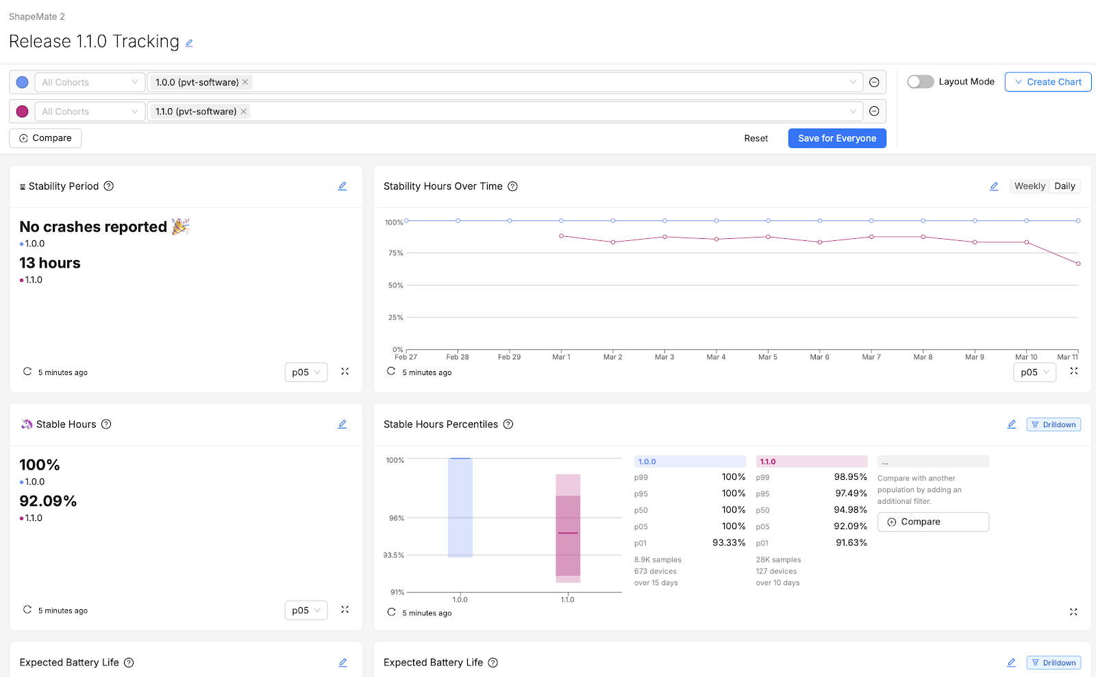
Explanation:
This dashboard was designed for a release manager who wants to know: does the version that’s currently in testing (1.1.0) improve on the device’s stability and battery life compared to their most-installed production version, 1.0.0?
They care about various percentiles of the population of devices, but their main go/no-go criteria all revolve around the being able to say that 95% of devices aren’t experiencing a noticeable regression. (In other words, that the performance of the p05 device is close to as good in the new version as it was in the old. That’s clearly not happening in this example!)
In the event that a regression does appear visible, they’ll immediately want to know how widespread it appears to be (in this case, the entire fleet looks more unstable), and whether there are any fluctuations over time that could account for this difference between versions. Then, they’ll want to “drill down” into some of the troubled devices running the newest test version to identify and flag suitable cases for further testing and debugging to the rest of the firmware engineering team.
This audience is very familiar with how these metrics are calculated and aggregated, so they don’t require much in-line explanation of what the different charts are showing.
Example 2: A “KPI” Dashboard for Executives
Audience:
- Director of Firmware Engineering
- Chief Technology Officer
Likely Questions:
- “I’m presenting to the Board in a few hours, and I need to know: in general, are we hitting our KPIs this quarter? If not, are our newer software version releases getting us closer to our goals?”
- “Since perceived connectivity issues result in the greatest number of RMAs, our #1 concern is improving connectivity. How frequently are our end-users experiencing downtime in their connection?”
- “Crashes are a less visible problem on our device, but still need to be kept within an acceptable margin. Is the device generally able to run a whole day without experiencing a crash?”
- “Does our expected battery life still meet or exceed what we’ve promised to our customers?”
Dashboard Layout:
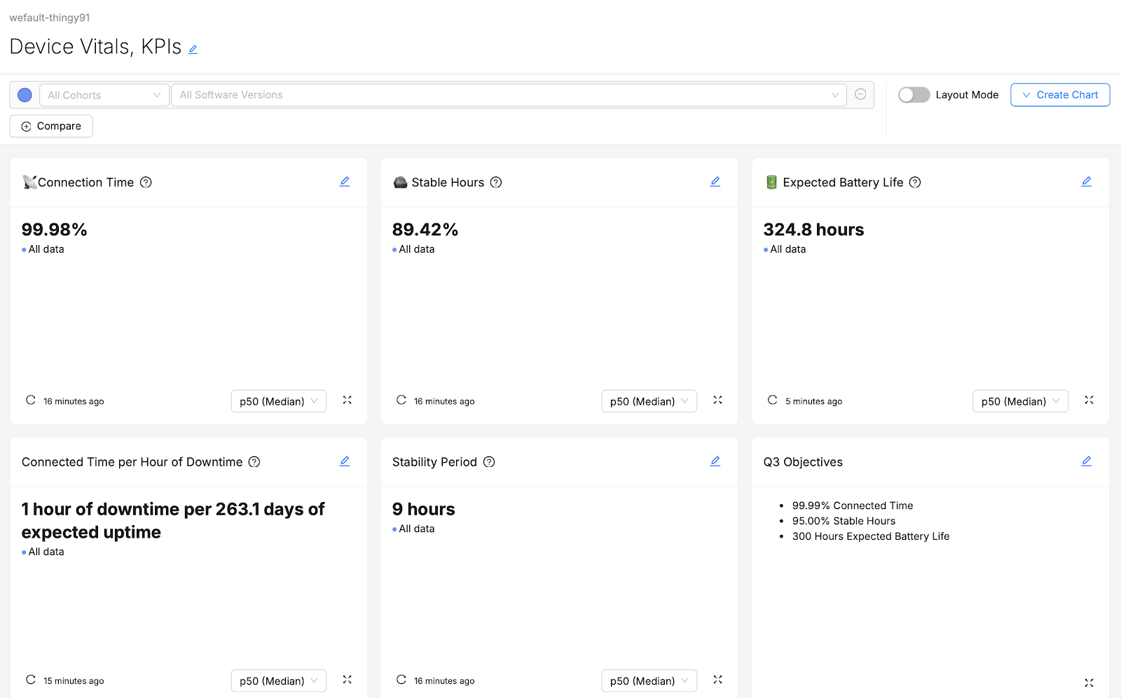
Explanation:
This dashboard is intended for executives who have a very clear idea of what their goals are and the scores they want their product to achieve. If they have questions about why their fleet’s vital measurements are the way they are, perhaps they will scroll further down the page to get further context for these top-line numbers, but perhaps they will instead ask a product manager or engineer to explain why things look the way they do.
Busy executives don’t want to have to visit multiple different dashboards to gather these top-line numbers; they’d prefer that it’s all in one place so they can spend as little time as possible grabbing the information while jumping between back-to-back meetings. They’re a technically-informed user, so they don’t require any explanations of what the vital metrics mean or how they are derived.
Example 3: A “Support Runbook” Dashboard for Customer Support
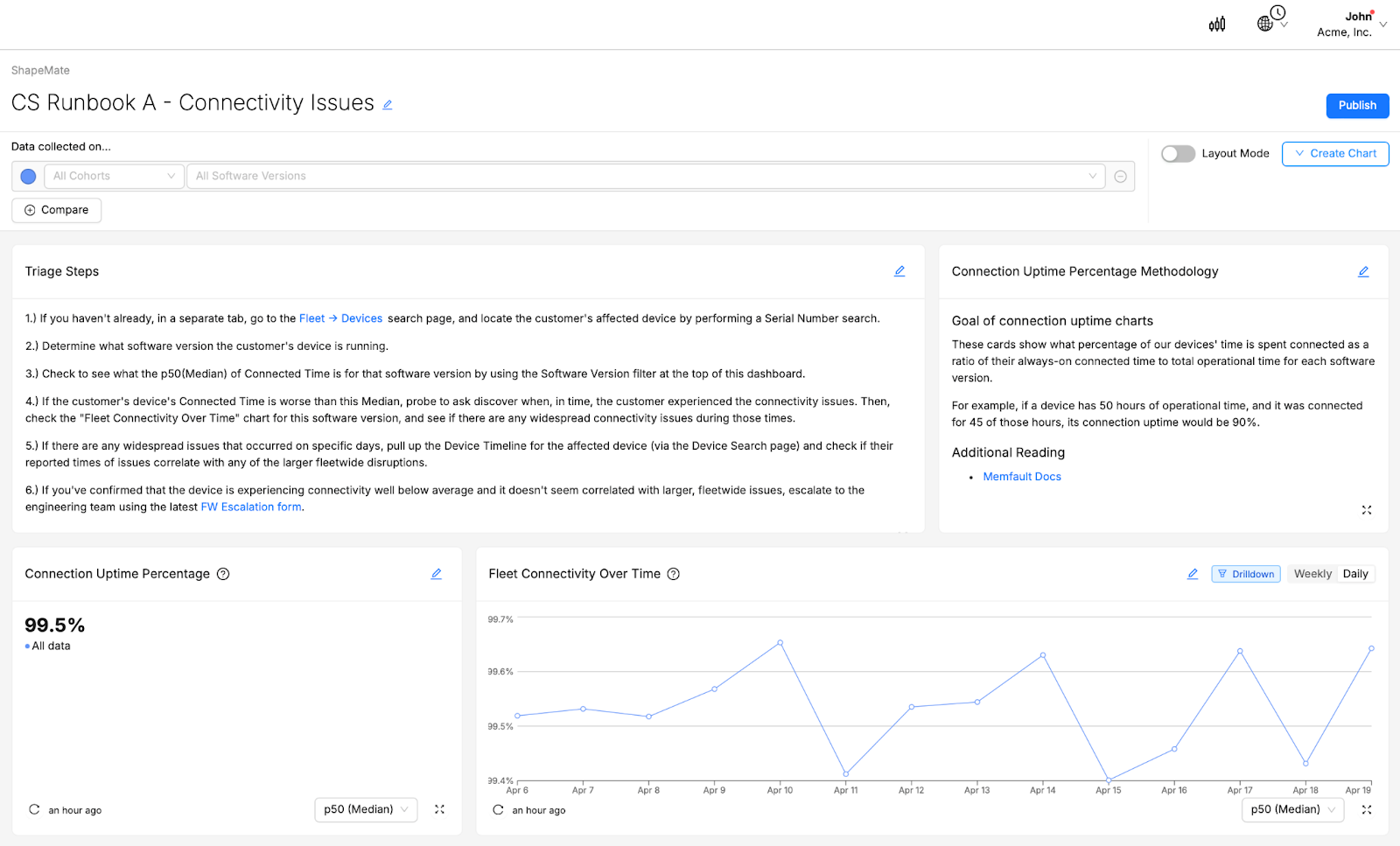
Explanation:
These Customer Support personnel focus on triaging issues in a very specific way. It’s worth their time to try and figure out whether a customer’s reported issue with their device is due to some hardware or software issue, something environmental, or even just expected behavior of the device that perhaps a customer doesn’t understand. It’s not worth their time to try to “get to the bottom” of a hardware or software issue.
Over-Time charts or other visualizations that may shed light on environmental fleetwide issues can be useful here, as well as Summaries that help to clarify what a device’s “normal” performance ought to look like. The dashboard focuses on a single metric (in this case, Connection Uptime), so that CS Personnel can focus on just this.
New Customer Support personnel frequently join the team and may not be technically informed, so they can benefit from explanations of given metrics and how they are derived. Documenting clearly defined triage steps within the dashboard ensures that all team members understand the steps they should take and how to stay within the scope of their support without wasting time. Enriching these steps with appropriate hyperlinks allows CS personnel to quickly access all the other resources they need to perform their tasks.
Experiment with IoT Monitoring Dashboards
As you create and refine your dashboards, remember the importance of tailoring your approach to meet the needs of your specific audience, choosing the right visualizations to convey your data clearly, and organizing your dashboard components strategically for maximum impact. Utilizing Markdown cards for enhanced clarity and adopting a thoughtful composition strategy will further elevate the effectiveness of your dashboards.
As you put these principles into practice, we encourage you to experiment with different configurations, visualizations, and data points to discover what works best for your use-case and your team.
Editor’s Note: A version of this article originally appeared in Memfault’s best practices guide: Using Device Vitals to Create Dashboards
Elevate Your Embedded Device Monitoring with Memfault
Memfault’s composable, configurable dashboards let you create just the right visualizations for your team to monitor your embedded devices. With high-level summary cards, detailed percentiles views, over time trend visualizations, and many more options, it’s easy to keep your audience informed with the right data, in the right format.
Dig deeper with Memfault’s powerful suite of debugging tools. And when fixes and updates are ready, ship them directly to your devices in the field with Memfault’s OTA solution. No matter who your audience is, Memfault gives you and your team the tools you need to make your software the most reliable part of your embedded device.